LOGO DEVELOPMENT
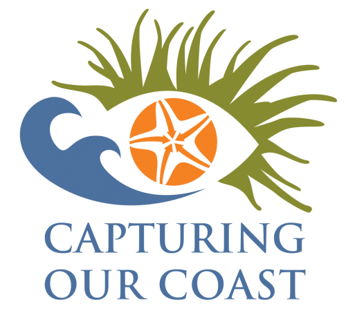
The Finalised Logo
The logo consists of three basic elements. Anemone tentacles, waves and a starfish. These elements are designed in such as way as to suggest the shape of an eye and a fish.
The anemone, starfish and fish represent nature and biodiversity.
The waves re-enforce the coastal nature of the project and shapes the tail of the fish.
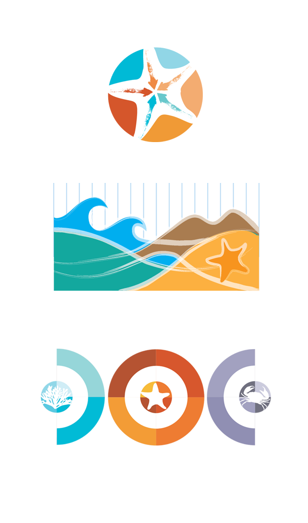
The silhouette of the starfish against the orange background is seen as if being viewed through a microscope.
Its five points breaks the circle into five segments and represents the projects transect protocol of set 5 species.
The starfish’s ambulacral ridges are arrows that converge to the centre of the starfish and represent the capture and flow of data.
The eye itself represents conservation and guardianship, as well as the evidence gathering and surveying aspect of the project. The colours chosen reflect the sea, sand and vegetation.


THE RESULT
Is a unique and distinctive visual identity which reflects the project’s personality and activities.


